


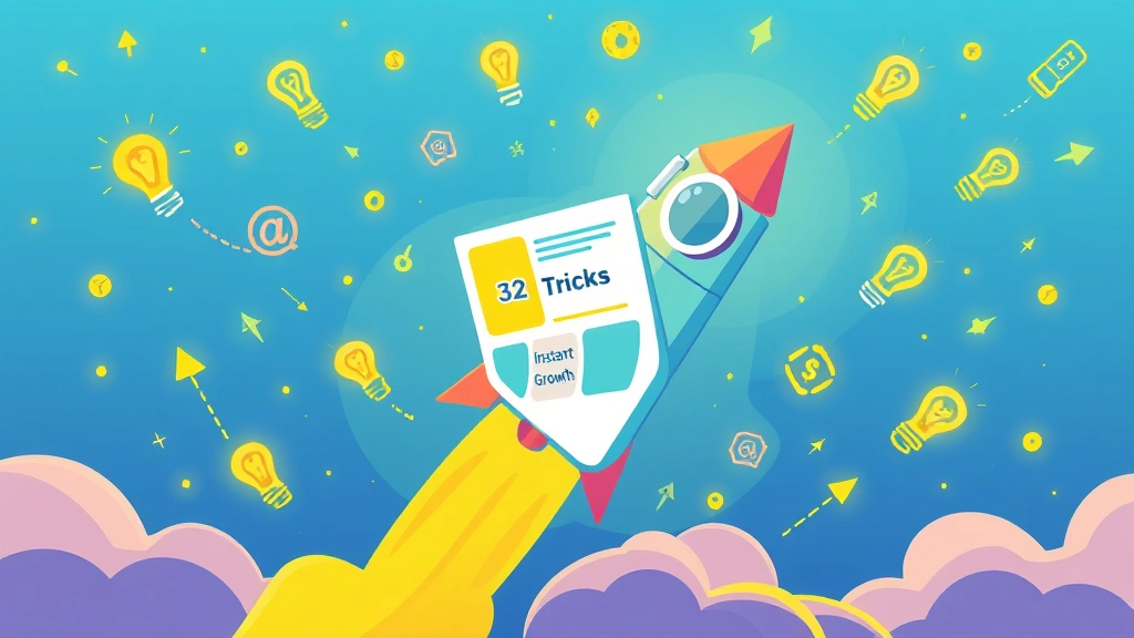
Landing pages are super important for getting leads. You want to make sure your landing pages are doing their best work. This guide will show you 32 simple tricks to get more leads right away. You'll learn how to make a landing page that really grabs attention and turns visitors into customers.
If you're serious about getting more leads and making your online marketing better, these tips are for you. We'll cover everything from how to design a landing page to making sure it actually converts.
Why Your Landing Page Matters So Much
Think of your landing page as your online salesperson. It's the one place where you want people to take action. A good landing page doesn't just look nice; it guides visitors to do exactly what you want them to do, like sign up or buy something.
What Makes a Great Landing Page?
A great landing page is clear, focused, and persuasive. It tells visitors what they need to know quickly and makes it easy for them to take the next step. It's all about making their journey smooth and simple.
Essential Elements for High-Converting Landing Pages
Let's break down the key parts that make a landing page work. Each element plays a role in getting you more leads.
1. Clear Call to Action (CTA)
Your CTA is the most important part. It tells people what to do next.
- Make it stand out: Use a contrasting color.
- Use action words: Like "Get Your Free Guide" or "Start Now."
- Keep it short: Two to five words is usually best.
2. Strong Headline
Your headline is the first thing people see. It needs to grab their attention fast.
- Be direct: Tell them what they'll get.
- Solve a problem: Show how you can help them.
- Keep it short: Aim for 10-20 words.
3. Benefit-Driven Copy
Don't just list features; tell people how your product or service will help them.
- Focus on them: Use "you" and "your."
- Explain the value: How will their life be better?
- Be concise: Get straight to the point.
4. High-Quality Images/Videos
Visuals make your page more engaging.
- Show your product: Or show people using your service.
- Use good quality: Blurry images look bad.
- Keep videos short: Around 60-90 seconds is ideal.
5. Social Proof
People trust what others say. Show them that others like you.
- Customer testimonials: Real quotes from happy customers.
- Trust badges: Logos of companies you work with.
- Number of users: "Joined by 10,000 happy customers."
6. Mobile Responsiveness
Most people use phones. Your page must look good on any device.
- Test it: Check how it looks on phones and tablets.
- Easy to tap: Make buttons big enough.
- Fast loading: Mobile users don't wait.
7. Fast Loading Speed
Slow pages lose visitors. Speed is key.
- Optimize images: Compress them without losing quality.
- Use good hosting: A reliable host helps.
- Limit scripts: Too many can slow things down.
8. Clear Value Proposition
Why should someone choose you? What makes you special?
- Be unique: What do you offer that others don't?
- Solve a specific problem: Don't be vague.
- State it clearly: Put it near the top of your page.
Design Tricks to Boost Conversions

Good design isn't just about looks; it's about guiding your visitors.
9. Use White Space
Don't cram too much onto your page. White space makes it easier to read.
- Give elements room: Don't let things touch.
- Focus attention: It draws the eye to important parts.
- Looks clean: A clean page is inviting.
10. Visual Hierarchy
Guide the eye to the most important information first.
- Bigger fonts for headlines: Make them stand out.
- Contrasting colors for CTAs: Make them pop.
- Logical flow: Information should lead naturally.
11. Consistent Branding
Your landing page should look like the rest of your brand.
- Use your logo: Place it clearly.
- Stick to your colors: Use your brand palette.
- Use your fonts: Keep the look consistent.
12. Minimal Navigation
Remove extra links that distract visitors.
- No main menu: You want them to focus on the offer.
- One goal: The page has one job, and that's it.
- Simple footer: Maybe just a privacy policy link.
13. Directional Cues
Use arrows, lines, or even people looking at your CTA.
- Subtle hints: Don't be too obvious.
- Guide the eye: Lead them to the form or button.
- Visual flow: Create a path for their eyes.
14. Trust Signals
Show visitors they can trust you.
- Security badges: For payment pages.
- Privacy policy link: Shows you care about their data.
- Contact info: Make it easy to reach you.
15. Scarcity and Urgency
Sometimes, a little push helps.
- Limited time offer: "Ends soon!"
- Limited stock: "Only 5 left!"
- Event countdown: For webinars or sales.
16. A/B Testing Elements
Always test different versions to see what works best.

- Test headlines: Try different wordings.
- Test CTAs: Change the text or color.
- Test images: See which ones resonate more.
Content and Copywriting Secrets
What you say and how you say it makes a huge difference.
17. Use Bullet Points
Break up long sentences into easy-to-read points.
- Highlight benefits: Make them stand out.
- Easy to scan: Readers can quickly grasp information.
- Boost readability: Makes your page less intimidating.
18. Address Pain Points
Show that you understand your audience's problems.
- Start with their struggle: "Tired of slow websites?"
- Offer your solution: "Our service speeds them up!"
- Relate to them: Use language they understand.
19. Clear and Concise Language
Avoid jargon and fancy words. Keep it simple.
- Short sentences: Easy to digest.
- Common words: Speak like a human.
- No fluff: Get to the point.
20. Tell a Story
People remember stories.
- Relatable scenario: "Imagine…"
- Problem-solution arc: How you help them win.
- Emotional connection: Make them feel something.
21. Overcome Objections
Think about why someone might hesitate and address it.
- "Is it too expensive?" Explain the value.
- "Is it hard to use?" Show how easy it is.
- "Will it work for me?" Provide case studies.
Technical and Optimization Tips
Beyond design and copy, some technical aspects are key.
22. SEO Basics for Landing Pages
Even though they're for conversion, a little SEO helps.
- Relevant keywords: Use them naturally in your copy.
- Optimized title tag: For search engines.
- Meta description: A short summary.
23. Use Retargeting Pixels
Track visitors so you can show them ads later.
- Facebook Pixel: For Facebook and Instagram ads.
- Google Ads Tag: For Google's ad network.
- Build an audience: Show ads to people who already showed interest.
24. Integrate with Email Marketing
Capture leads and follow up automatically.
- Connect your form: To your email service.
- Send a welcome email: Immediately after signup.
- Nurture sequence: Send a series of helpful emails.
25. Track Conversions
Know how many people are filling out your form or buying.
- Google Analytics: Set up conversion goals.
- Ad platform tracking: For your campaigns.
- Understand your ROI: See what's working.
26. Optimize Form Fields
Make your forms easy to fill out.
- Only ask for what you need: Less is more.
- Clear labels: Tell people what to put where.
- Error messages: Help them fix mistakes.
Advanced Strategies for Maximum Impact

Ready to take your landing pages to the next level?
27. Video Landing Pages
Sometimes a video explains things best.
- Keep it short: Under 2 minutes.
- Engaging content: Hook them quickly.
- Clear CTA: In the video or right below it.
28. Personalized Content
Show different content to different visitors based on what you know about them.
- Dynamic text replacement: Change headlines based on ad clicks.
- Segment audiences: Show specific offers.
- More relevant experience: Makes them feel understood.
29. Exit-Intent Pop-ups
Catch visitors before they leave your page.
- Offer a last chance: "Don't go yet!"
- Special discount: For those about to leave.
- Email signup: Capture their info before they're gone.
30. Live Chat Integration
Answer questions instantly and build trust.
- Be available: Have someone ready to chat.
- Answer quickly: Don't make them wait.
- Resolve issues: Turn questions into conversions.
31. Heatmaps and Session Recordings
See exactly how people interact with your page.
- Where do they click? Heatmaps show hot spots.
- Where do they scroll? See if they miss important info.
- Watch their journey: Session recordings are like a video of their visit.
32. Post-Conversion Follow-Up
Don't just get the lead; keep them engaged.
- Thank you page: Confirm their action.
- Next steps: Tell them what to expect.
- Welcome sequence: Start building a relationship.
Key Takeaways
- Focus on the user: Make everything easy and clear for them.
- Test everything: You never know what will work best until you try.
- Keep it simple: Less clutter means more conversions.
- Build trust: Show visitors why they should choose you.
- Optimize for mobile: Most people are on their phones.
Remember, building a great landing page is an ongoing process. You'll always be learning and improving. But with these 32 tricks, you're well on your way to getting more leads instantly.
FAQ
Q1: How often should I update my landing page?
You should update your landing page regularly, especially if you're not seeing the results you want. Small changes can make a big difference. Test new headlines, images, or calls to action every few weeks to see what performs best.
Q2: What's the most important element of a landing page?
The most important element is a clear and compelling Call to Action (CTA). Your CTA tells visitors exactly what you want them to do. If your CTA isn't strong, people won't know how to move forward, no matter how good the rest of your page is.
Q3: How many form fields should I include on my landing page?
Aim for as few form fields as possible. Only ask for the information you absolutely need. Each additional field can reduce your conversion rate. For example, if you just need an email, don't ask for a name and phone number.
Q4: Should I include navigation links on my landing page?
No, it's best to remove all navigation links (like a main menu) from your landing page. The goal of a landing page is to get visitors to focus on one specific action. Navigation links can distract them and lead them away from your main offer.
Q5: How long should my landing page be?
The length of your landing page depends on your offer. For simple offers (like a free download), a shorter page is often better. For complex products or services, a longer page might be needed to explain everything. The key is to include all necessary information without overwhelming the reader.
Ready to put these tricks to work? Start by picking a few that seem most relevant to your current landing pages. Implement them, test the results, and watch your leads grow! If you want a deeper look at your current setup, consider getting a free audit. And for more resources, check out our free landing page prompts and Figma files to kickstart your design process.